


Tusted by


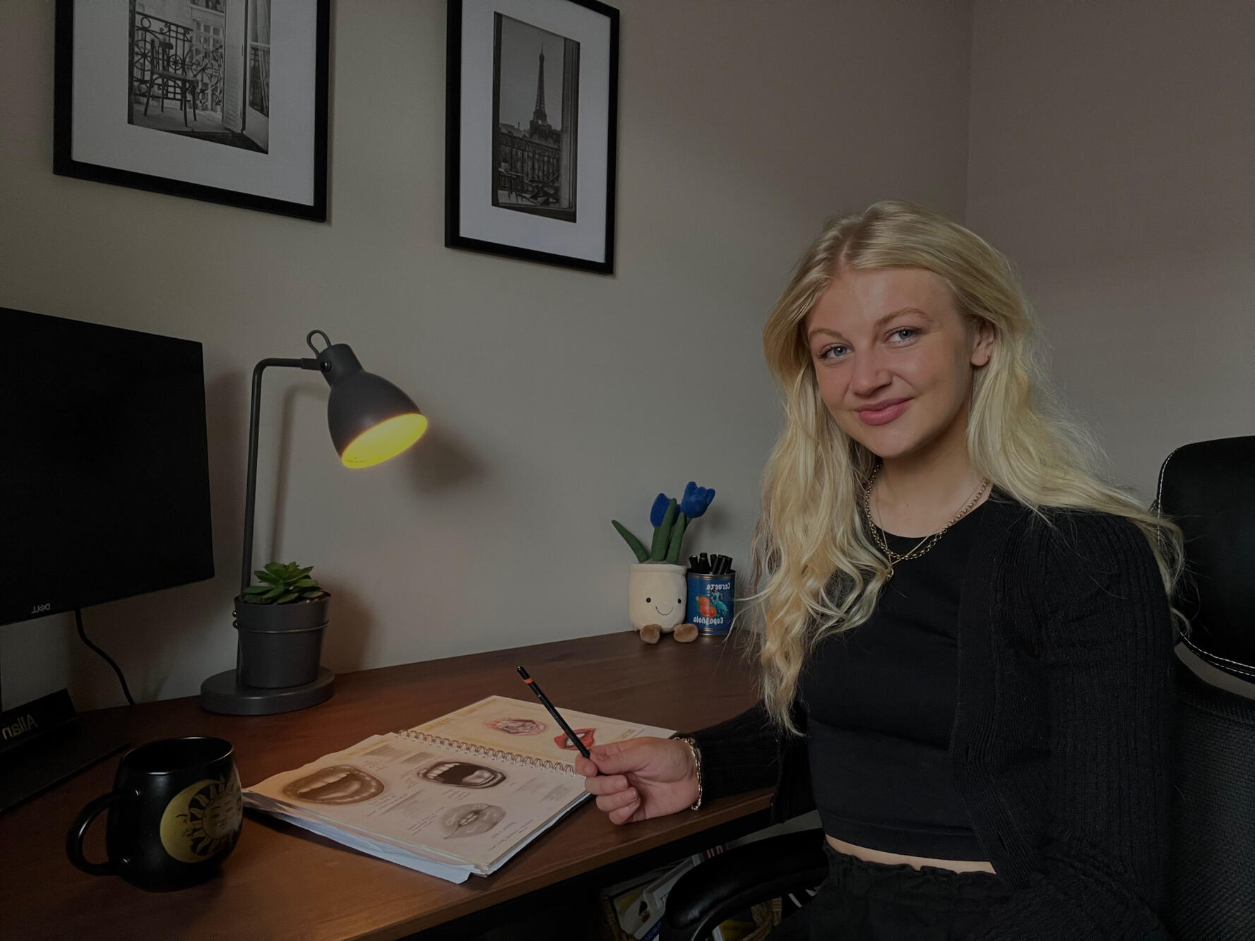
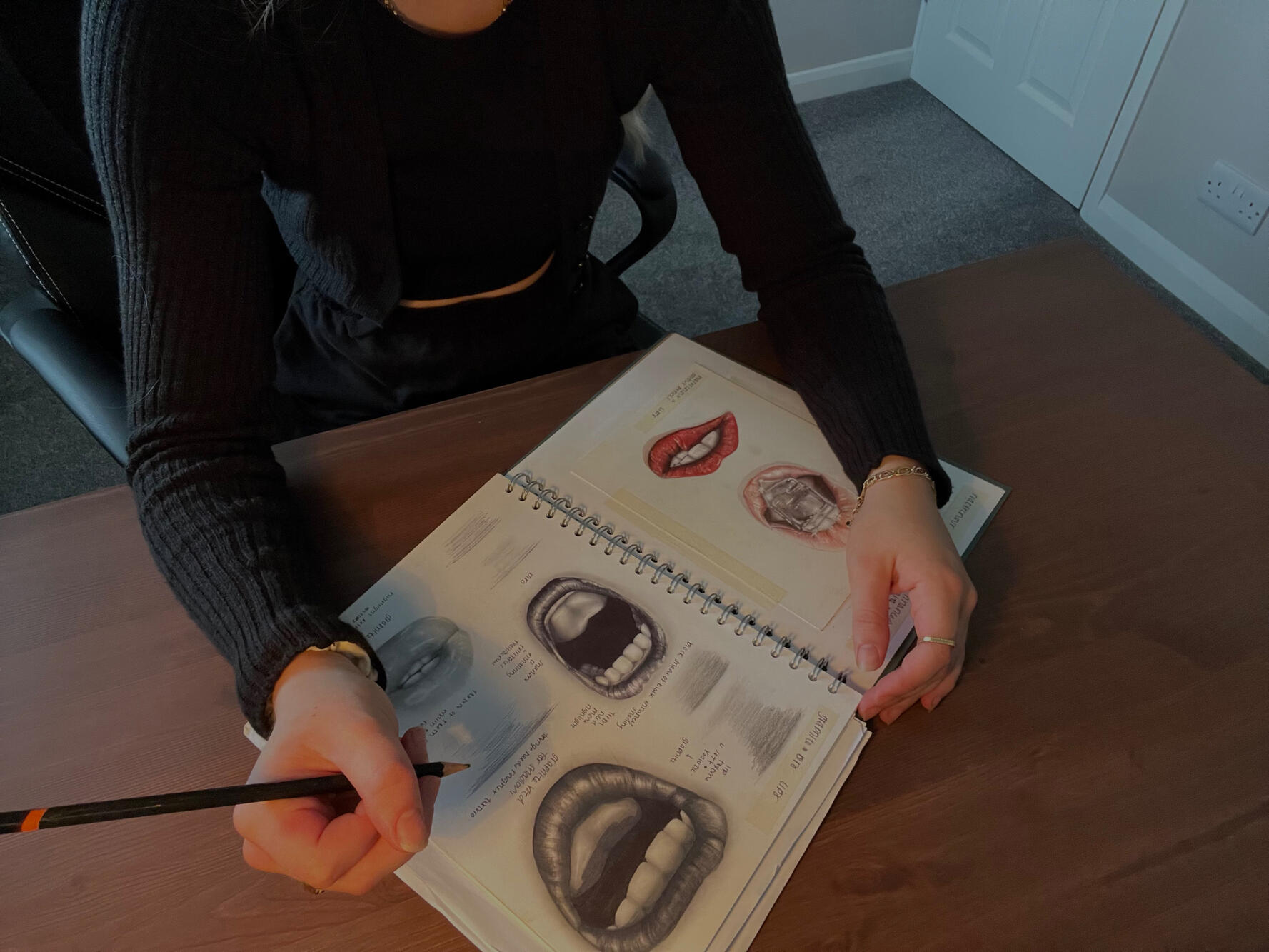
Creativity has always been at my core — drawing, experimenting, and diving into new design tools and processes always felt natural.I love exploring how design can tell a story, and now I specialise in strategic brand design.
Over the years, I’ve worked across various industries, helping businesses not just get noticed but truly grow.For me, it’s all about continuous learning, collaborating with inspiring clients, and crafting brands that make a real impact.

Working with me means you're fully involved in a creative process that's designed to uncover the heart of your brand story.It's a thoughtful, step-by-step journey — from discovery to delivery — built to keep you informed, involved, and inspired at every stage.No guesswork, just a clear, collaborative process that makes things easy, and brings your brand to life with purpose.
"The whole branding process was so smooth from start to finish. I always felt in the loop, and the final design genuinely reflects the business's history. The logo is illustrative and has become a key element used consistently across the entire brand."
Sam R
"The whole process was smooth and straightforward. Connie really got what we were looking for and created branding that fits our business perfectly. We’re really happy with the result.”
David C
I'd love to hear your story
Want to partner with me?
Tell me about your business and goals, and I’ll bring it to life through design.
I'd love to hear your story
Want to partner with me?
Tell me about your business and goals, and I’ll bring it to life through design.
Recent projects built with strategy and creativity.


Designs that help achieve your goals and engage your audience.
Whether you're starting from scratch, evolving your current identity, or just need one-off assets, I offer flexible solutions designed to meet your unique needs. Every brand is different — and that’s exactly how I approach every project.
One-Time Projects
Quick-turn design support — perfect for single assets or small-scale needs without long-term commitment.
Custom Brand Packages
Strategic bundles tailored to your brand goals, whether you're launching, repositioning, or scaling.
Ongoing Monthly Support
Consistent creative support that grows with your business — ideal for teams or brands with evolving needs.

Brand Design
Strategic, custom brand identities — logo, typography, colour palette, and brand guidelines — all built to reflect your values and connect with your audience.

Custom Illustrations
Distinctive illustrations to enhance storytelling, bring campaigns to life, or add personality across editorial, marketing, or digital platforms.

Branded Business Assets
Cohesive tools to keep your brand polished across every touchpoint, print and digital.

Website Design
Fully branded websites built on flexible, managed platforms — making your digital home look and feel just like you.

Social Content & Templates
Social-first visuals designed for engagement and consistency — including graphics, post templates, and launch materials.
A hands-on creative process that keeps you involved — from ideas to final design.
01. Enquiry & Discovery
Once you reach out via my website or socials, we’ll have a relaxed Discovery Call to chat about your goals, vision, and what you are looking for.You’ll then receive a custom proposal outlining scope, timeline, and investment. Once approved, I will share a contract and deposit secure your project.


02. Strategy & Direction
Before designing, I dive into strategy with a questionnaire or strategy session, depending on your package, to uncover your purpose, audience, tone, and market position.Then I create 2–3 visual moodboards exploring different creative directions. You choose the one that feels right, and we use that as our guide for the design phase.

03. Design & Development
With a clear direction, I start developing the concept — from sketches and typography to colour palettes and illustration style.I keep you in the loop throughout, sharing progress and encouraging feedback so you feel involved every step of the way.


04. Showcase & Feedback
Once the initial concept is ready, I will walk you through the design — explaining the thinking and how it connects back to your goals. You’ll see the full brand in action, from logo and colours to mockups and real-world use.Two rounds of refinement are included to fine-tune everything until you’re 100% confident and excited about the final result.

05. Final Delivery & Launch
After approval, I’ll prepare and send over all final assets in every format you’ll need — from logos and illustrations to templates and brand guidelines, so you can keep things consistent moving forward.
Ongoing Support
I value long-term client relationships and love seeing how your brand continues to grow.
I offer post-launch support, whether it’s applying your new look to social templates, or building additional brand assets.
Coward's Milk
Full brand creation for a rebellious alternative-milk, balancing a playful tone with purpose-driven strategy across identity, packaging, and voice.Coward’s Milk needed to stand out in a crowded market while staying true to its cheeky roots. I developed a bold, irreverent identity that turns "cowardice" into a badge of honour — building a cohesive brand that’s as fun as it is functional, from shelf to social.

The Brand
Coward’s Milk is a plant-based milk brand with a bold name, cheeky tone, and ethical mission. Grown on a family-owned farm, it’s made for conscious consumers who skip dairy for personal or ethical reasons — and don’t mind poking fun while they do it.The Challenge
The brand needed to communicate its values and stand out visually, all while staying light-hearted. The goal was to turn the “coward” concept into something empowering and proud, backed by a design system that grabs attention and speaks directly to its people.The Solution
I worked closely with the client from the start to build the brand.
• Aligned on brand positioning, tone of voice, and strategy
• Designed a bold visual identity that blends humour with heart
• Created distinctive, character-led packaging that stands out in a crowded market
• Developed supporting brand assets to keep everything consistent and confident.The result
A loud-and-proud brand that’s instantly recognisable, audience-aligned, and impossible to ignore.
The Typography & Colour Palette
Playful, punchy, and full of personality.
Knewave – used for the logotype; bold, fun, and energetic
Heiti SC – for contrast and simplicity
Handwritten Accents – creates harmony with the illustrated logoThe palette features earthy neutrals with pops of red — a nod to farming tradition. Historically, farmers used milk-based paint mixed with lime and iron oxide, giving barns their signature red while protecting wood. Red became a lasting symbol of rural life and hard work.

The Logo
The illustrative logo features a shocked cow with its mouth open, shouting “NO WHEY” — hand-lettered to emphasise the dairy-free message. Fun, memorable, and unmistakably Coward’s.


Stratt
Strategic rebrand and full rollout, including design and development of all brand assets, for a life science consultancy ready to grow — turning a startup look into a sharp, expert-led brand.Stratt appeared more like a creative agency than the data-driven consultancy they are. They needed a brand that matched their expertise and ambition. I built a bold, insight-led identity that reflects who they are, builds trust, and supports their next stage of growth.

The Brand
Stratt is a consultancy specialising in life science innovation — combining data, insight, and strategy to deliver outcome-obsessed results for high-level clients.The Challenge
Their branding felt more like a design studio than a life science consultancy — soft colours, rounded shapes, and a tone that didn’t reflect their expertise. This can cause confusion and attract the wrong clients. A clearer, more professional brand was key to attracting the right audience, building trust, and scaling their business.The Solution
With just the logo remaining, I created a cohesive brand identity grounded in clarity, credibility, and future-thinking.
• A refined colour palette to show sophistication, spark innovation, highlight sustainability, and build trust.
• Blueprint-style illustrations and data-led visual storytelling showed off their strategic depth.
• I designed and developed the new branding across their entire ecosystem — including a custom-built website, insight blog, social content, and pitch decks.
• Brand guidelines were delivered to support future growth with consistency and clarity.The Result
A brand repositioned with authority — landing bigger, better-fit clients, growing their team, and moving into a Central London office. The strategic brand system now supports their scale-up goals.
The Typography & Colour Palette
A modern, professional typeface combined with a bold, distinctive colour palette.
We kept the existing typefaces — Gazpacho (a serif font) and Barlow (a sans serif) — because they balanced each other well. Gazpacho added a creative, classic touch for the logo and headings, while Barlow’s clean, simple style worked perfectly for subheadings and body text. Together, they gave the brand a professional yet approachable feel.
• Monochrome: clarity and confidence
• Electric Green: bold innovation
• Forest Green: sustainability focus
• Analytical Blue: trust and expertise

The Brand Elements
The rebrand included a suite of brand elements to be used and a style to use concistantly.
• Blueprint-style illustrations highlighting problem-solving and insight
• Large enterprise imagery to highlight their presence
• Data charts and infographics to visually communicate depth and value


Affinity
Full internal brand development for a global pharmaceutical company — from naming to visual identity, designed to support connection, collaboration, and smarter workflows.Gilead needed an internal brand to help colleagues communicate more clearly and manage workloads with ease. I led the full creative development of Affinity — from naming and brand identity to digital applications and physical assets — designed to foster community and connection within the organisation.

The Brand
Affinity is an internal Gilead initiative focused on improving collaboration, communication, and clarity across teams — helping employees work better, together.The Challenge
The internal team needed a distinct brand that felt connected to Gilead but stood on its own. It had to represent harmony, digital ease, and team unity — while being easy to roll out across multiple touchpoints, from digital platforms to internal events.The Solution
I collaborated on every step of the Affinity brand — from naming and strategy to visual identity and implementation• Collaborated on naming, choosing Affinity to reflect connection, community, and harmony.
• Designed a custom logo using a monospaced typeface to nod to its digital-first nature. The letter A was customised with a smooth band wrapping around it — a symbol of connection and unity.
• Developed a colour palette centred on vibrant purple — a symbolic blend of Gilead’s red and blue — supported by grey, black, and white to keep it clean and professional.
• Created full brand guidelines for consistency and growth.
• Helped implement the brand across digital internal platforms, printed assets, and employee events.The Result
Affinity launched as a recognisable and trusted internal brand, helping Gilead foster a stronger sense of collaboration and improving the way teams connect. The identity is scalable, easy to use, and well integrated across touchpoints — setting the foundation for future internal initiatives.
The Typography & Colour Palette
Designed to be digital-forward, modern, and collaborative.
Typography: I used Fira Mono for its clean, digital feel and Trebuchet MS to add balance with its friendly touch. The custom A acts as a standalone brand icon — symbolising harmony, connection, and forward motion.
Palette:
• Vibrant Purple: at the heart of the brand, symbolising unity and the blend of Gilead’s red and blue
• Grey, Black & White: to balance and support clarity

The Logo
A clean, monospaced wordmark with a customised A — featuring a smooth, connective band to symbolise collaboration and flow. The standalone A works across digital and physical assets as a recognisable internal icon.


Narrative
Full brand identity crafted to reflect a bold, modern marketing agency on a mission to educate through storytelling — bringing strategy and creativity together to fuel growth.Narrative wanted a brand as bold as their vision. I created a vibrant, strategic identity rooted in storytelling and education — delivering a unique logo, flexible brand assets, and social templates designed to capture attention and build authority across their main platforms.

The Brand
Narrative is a forward-thinking marketing agency that leads with storytelling. They focus on educating, building trust, and helping brands grow through content-driven strategy.The Challenge
Their existing branding was generic, inconsistent, and didn’t reflect who they were. Without a clear identity, their messaging got lost — and their ideal clients couldn’t find them. Their strategy and values as storytellers weren’t showing up in their visuals, which stalled growth and recognition.The Solution
I worked closely with Narrative to bring their brand story to life visually.
• Designed a custom wordmark logo with a balance of creativity and clarity — combining an illustrative ‘N’ with clean, sans serif typography to reflect both storytelling and education.
• Delivered bold, flexible social media templates and brand guidelines to keep their presence consistent and impactful.
• Developed a vibrant colour palette to support their brand personality and help them stand out across digital touchpoints.The Result
Narrative emerged with a confident, modern brand that reflects their mission. Their content now looks cohesive and eye-catching, and their visuals clearly communicate their values and direction.
The Typography & Colour Palette
The identity combines clean, modern type with an energetic colour system.
Logotype: An original wordmark using a custom illustrative N and modern sans serif for contrast — storytelling meets strategy.
Typography: Afacad brings structure and edge, while Allan adds character and clarity — a distinctive pairing for a brand built on strategy and storytelling.
Palette:
• Sparking Blue & Electric Green – creative, vibrant, and growth-focused
• Monochrome Tones – professional and groundingThe contrast draws attention, especially across social platforms.

The Logo
The logo is a custom wordmark: ‘Narrative’ in monochrome, with an illustrated ‘N’ symbol used as a standalone brand mark. It’s bold, ownable, and instantly recognisable, balancing creativity with clarity.


DC & K Rolls Farm
Heritage-inspired logo design for an 88-year-old family farm — blending tradition with timeless design for a professional, cohesive identity.I worked closely with the client to create a logo that honours the farm’s long history while standing apart in a space where many visuals feel the same. The result is a refined identity that reflects their legacy and unites their brand across all touchpoints.

The Brand
DC & K Rolls is a family-run farm with over 85 years of history. Known for their long-standing commitment to quality and community, the Rolls name has been at the heart of the business for generations.The Challenge
The goal was to create a logo that captured the farm’s heritage and range of services without falling into overused or cliché rural imagery. It needed to feel meaningful, unique, and versatile across all customer-facing platforms.The Solution
I collaborated with the client to design a logo that represents the strength of their legacy.
• Built the identity around a calligraphic R, a nod to the Rolls name that has been central to the family business for generations
• Positioned the R between “Est. 1940” to highlight their heritage and authority
• Selected a script style to reflect elegance, longevity, and care — qualities that match the farm’s reputation and values
• Delivered a professional, timeless mark that sets them apart while staying true to who they are.The Result
The logo gives DC & K Rolls Farm a visual identity they can proudly use across signage, packaging, social media, and more. It ties their history into every touchpoint, helping them appear polished, consistent, and ready for the future.
The Logo
Calligraphic R: Elegant, timeless, and rooted in tradition — a modern take on classic lettering that reinforces the farm’s long-standing legacy
The logo is designed in monochrome for maximum versatility and sophistication across all applications


CHKPA
Full brand identity and mascot design for a playful, hummus-loving startup — designed to turn heads, spark smiles, and bring flavour to the streets.CHKPA is a cheeky, chilled hummus brand launching from a street food van. I created a bold, character-led identity that’s fun, friendly, and full of personality — built to connect with a younger audience and bring hummus joy wherever it goes.

The Brand
CHKPA is a hummus brand with a laid-back attitude and a love for bold flavour. With a focus on fun, good food, and a strong visual presence, it’s designed for a younger crowd looking for something fresh, feel-good, and full of character.The Challenge
As a startup selling from a van, CHKPA needed a stand-out brand identity to build recognition fast. The visual style had to be lighthearted and approachable, while still looking polished enough to grow into packaging, merch, and future products.The Solution
I built a fun, expressive brand identity that captures the spirit of CHKPA.
- Created a custom mascot logo featuring a smiling swirl of whipped hummus to reflect the brand’s playful energy
- Designed the slogan "Happy Hummus" to reinforce the upbeat, feel-good vibe
- Developed hand-drawn chickpea illustrations for use across packaging, signage, and pattern work
- Built a bold colour palette centred on hummus yellow for warmth, with accents of royal red (boldness), green(freshness), and blue (trust and street-food cool)
- Chose Anton as the display typeface — giving a varsity-style edge that feels fun, youthful, and punchy
- Integrated the logo type into the hummus bowl illustration for a unique, memorable finishThe Result
CHKPA launched with a vibrant identity that instantly grabs attention. The mascot and bold colour palette make it easy to spot, while the playful tone connects with their target audience of under-30s.
The Typography & Colour Palette
Typography: Anton is a bold, varsity-style font that brings energy and playfulness, perfect for the young, casual food-loving audience.
Colour Palette:
- Hummus Yellow – warm, inviting, and instantly recognisable
- Royal Red – for boldness and appetite appeal
- Fresh Green – to nod to natural ingredients and freshness
- Vibrant Blue – for trust, contrast, and a cool street-food edge

The Logo
A custom mascot featuring a smiling swirl of hummus, paired with bold Anton lettering smoothly tucked into the bowl shape. It’s playful, memorable, and instantly ownable — built for street food now and shelf presence later.


Wilfred Grey
Wilfred Grey is a heritage-inspired lifestyle brand that blends British tradition with modern prestige.
Created for future champions, I developed a full brand identity—including a custom logo, refined typography, illustrative assets and graphics, social media content, and comprehensive brand guidelines.

The Brand
Wilfred Grey is a British lifestyle brand rooted in tradition, prestige, and performance. Blending heritage design with modern ambition, it’s built for students with drive, young professionals on the rise, and elite sports champions. The brand stands for quiet strength, refined style, and the mindset of those who lead by example.The Challenge
The brand needed a cohesive visual identity that could communicate heritage and elegance while appealing to modern audiences who value ambition, legacy, and understated sophistication.The Solution
A refined, versatile identity system was created to reflect Wilfred Grey’s core values of wealth, power, and luxury:
• Defined six core visual themes: Sport and Athletics, British Tradition, Champions and Achievement, Luxury and Prestige, Ambition and Inspiration, and Strength and Resilience
• Developed a logo combining a lion and the Union Jack, symbolising pride, heritage, and excellence
• Chose serif and sans serif fonts that balance tradition and clarity across print and digital use
• Curated a rich colour palette using historically elite tones (emerald, burgundy, navy) alongside grounded neutrals
• Designed supporting brand materials (packaging, apparel, and digital) to feel both prestigious and aspirationalThe Result
CHKPA launched with a vibrant identity that instantly grabs attention. The mascot and bold colour palette make it easy to spot, while the playful tone connects with their target audience of under-30s.
The Typography & Colour Palette
Typography: The primary typeface, Iowan Old Style, is an elegant serif that brings a classic, refined character rooted in British tradition. It’s paired with Albert Sans, a clean and contemporary sans serif that adds clarity, balance, and a confident modern edge—ideal for digital and everyday brand communication.
Colour Palette: Wilfred Grey’s palette is led by bold, heritage-inspired tones that convey strength, prestige, and ambition. Rich emerald green, deep navy, and classic burgundy serve as the primary colours—each evoking tradition, power, and refined luxury. These are balanced by a suite of soft neutrals: warm ivory, stone taupe, layered greys, and crisp white, providing clarity, contrast, and versatility across touchpoints.

The Logo
The Wilfred Grey logo combines a lion with the Union Jack to symbolise strength, heritage, and national pride. The lion represents courage, leadership, and resilience—qualities shared by the brand’s ambitious audience. Integrated with the Union Jack, the mark reinforces British identity while creating a bold, recognisable emblem that feels both timeless and aspirational. Designed for flexibility, the logo works across apparel, digital, and print with equal impact.


Wild Grain Pantry
Wild Grain Pantry is an organic cereal bar brand with a bold, nature-inspired identity. I developed the full brand and packaging design—logo, typography, colour palette, illustrations, and visual style—capturing its raw, playful, and earthy character.

The Brand
Wild Grain Pantry is an organic cereal bar brand rooted in nature and full of character. Built for those who value natural living and untamed energy, it celebrates wild ingredients with a bold, rustic twist. The brand speaks to eco-conscious adventurers who want to eat clean—but don’t take themselves too seriously.The Challenge
In a health food market dominated by minimalism and polish, Wild Grain Pantry needed an identity that stood out—one that felt earthy, authentic, and a little bit wild. The brand had to reflect its natural origins while appealing to modern consumers who crave something with soul and personality.
The Solution
I created a full brand identity and packaging design system that brings Wild Grain Pantry’s playful ruggedness to life:
• A standout illustrated logo featuring a cowboy riding a tiger with a lasso, symbolising untamed energy, power, and a quirky, rebellious spirit
• A bold, earthy colour palette combining grainy forest green, burgundy, baby blue, and ochre yellow to balance nature with unexpected personality
• Hand-drawn elements and textures to reinforce the artisanal, grounded nature of the product
• A custom packaging design for the signature cereal bar, blending raw materials and whimsical storytelling
• A typography system that pairs Gentium Book Basic for warmth and tradition with Geist for modern clarity and contrastThe Result
The final identity feels wild, grounded, and unforgettable. With a visual system that’s both rustic and slightly offbeat, Wild Grain Pantry stands out on the shelf while staying true to its natural, handcrafted roots—attracting consumers who want something honest, energetic, and refreshingly different.
The Typography & Colour Palette
Typography: Wild Grain Pantry uses Gentium Book Basic, a serif with warmth and traditional charm, to evoke craft and authenticity. It’s paired with Geist, a clean, neutral sans serif that adds structure and clarity—creating a balance between rustic appeal and modern readability.Colour Palette: The colour palette draws directly from nature with a twist. A grainy forest green brings depth and freshness, while burgundy adds richness and appetite appeal. Baby blue offers a cool contrast that keeps things light, and ochre yellow injects warmth and sun-baked energy. Together, the colours create a grounded yet playful identity that feels both real and original.

The Logo
The logo captures the brand’s wild personality through a surreal illustration: a cowboy riding a tiger mid-lasso. This playful symbol evokes energy, strength, and movement, while leaning into the weird, unexpected side of the brand. It’s bold, distinctive, and packed with storytelling potential.


Tetris
A series of social media and website mockups designed to elevate the digital presence of a pharmaceutical company during a period of growth.

The Brand
A forward-thinking pharmaceutical company driven by innovation, trust, and accessibility. Amid significant business growth, they needed a digital presence that reflected their evolving scale—modern, credible, and easy to navigate.The Challenge
The brand wanted mockups for a refreshed social media presence and website design that would feel modern, clean, and approachable.The Solution
I designed a series of high-impact visuals for both platforms:
• Social media mockups with informative, digestible content layouts
• A clean, intuitive website interface focused on trust, accessibility, and clarity
• Visual direction that balances medical authority with human warmth.The Result
The mockups established a clear digital style that could be rolled out across platforms—bringing consistency, trust, and a modern edge to the brand’s online presence.

